How to create a sliding image carousel in Shopify

This step-by-step guide teaches you how to create a sliding image carousel in Shopify for free no plug-in required. Image carousels are a great way to display images on web pages. They take up little real estate space and allow for many images to be displayed, meaning you can show your customers a l

This step-by-step guide teaches you how to create a sliding image carousel in Shopify for free no plug-in required.
Image carousels are a great way to display images on web pages. They take up little real estate space and allow for many images to be displayed, meaning you can show your customers a lot of detail without them needing to scroll down continuously on the page.
Unfortunately, Shopify’s most popular theme (Dawn) does not have a section to add image carousels by default. So, we need to create one by manipulating the code.
In this step-by-step guide, we explain exactly how to achieve this. If, at any point, you decide this is out of your depth and would like us to implement it for you, please reach out to us.
How we’re going to achieve this
We will take the existing multicolumn section, which is used by default, and duplicate it by editing the Shopify code. Once duplicated, we will add the sliding (swipe) carousel function.
Once we’ve built this, we can add unique images to each product using Shopify’s meta-fields function. We’ve written a free step-by-step meta-fields guide for that too.
Step-by-step guide:
Coding Steps:
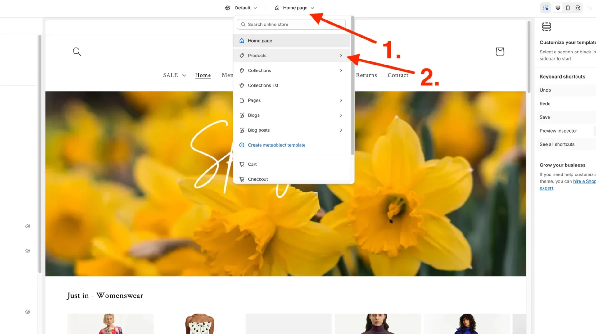
Step 1. Login to Shopify and click “online store, then Themes.
Then click the three dots ellipsis button and click edit code.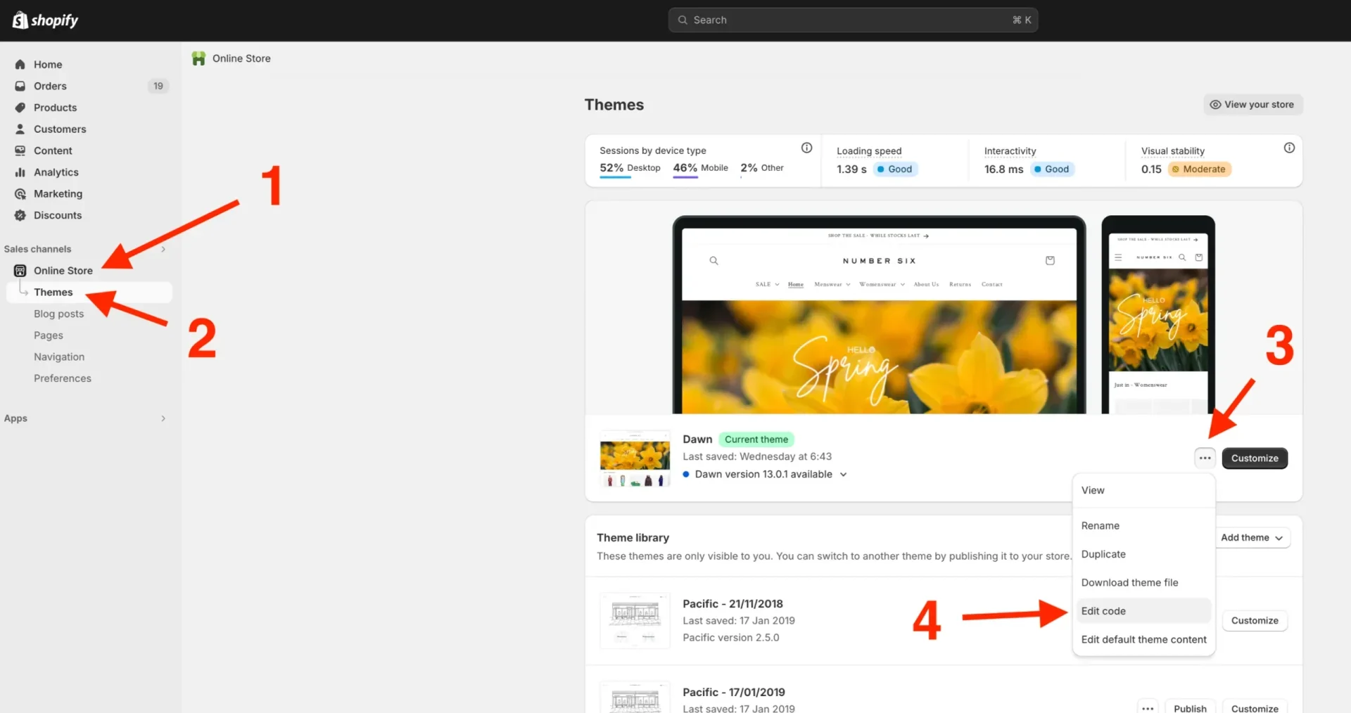
Step 2. Scroll down to the sections on the left-hand side and click the word “Sections”, then “Add a new section”.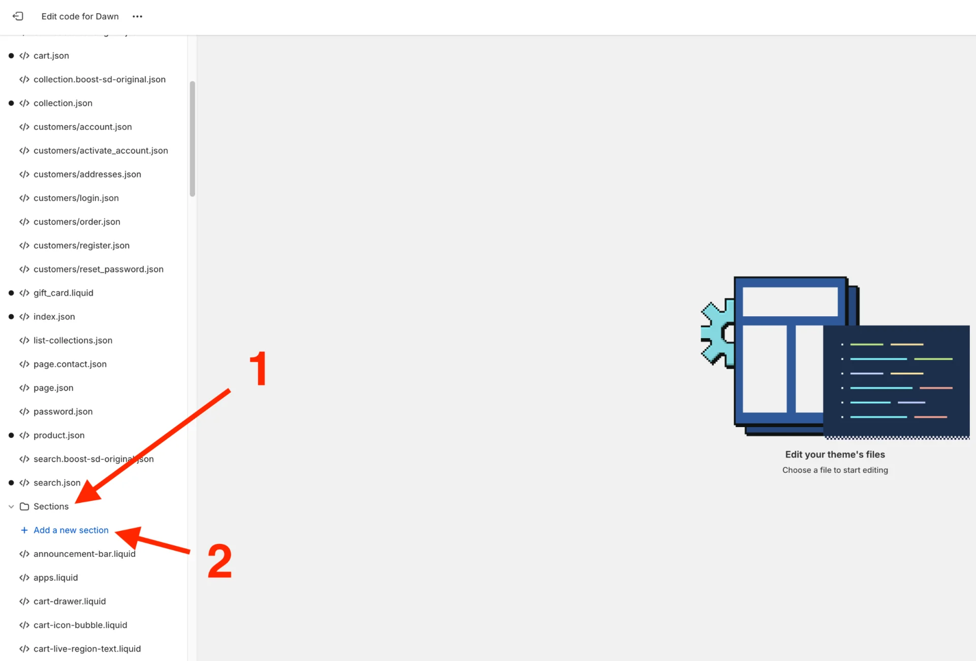
Step 3. Create a new section and leave the option as the default “liquid” rather than JSON type, name it “imagecarousel”, and click done.
Step 4. Highlight all the schema code which is there and delete it.
Step 5. Copy all the content (code) from the multicolumn.liquid file, which is under Sections.
Step 6. Paste this code into the newly created imagecarousel.liquid file.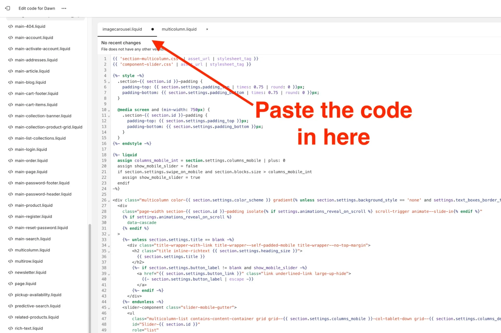
Step 7. Add a new asset under Assets on the left-hand menu.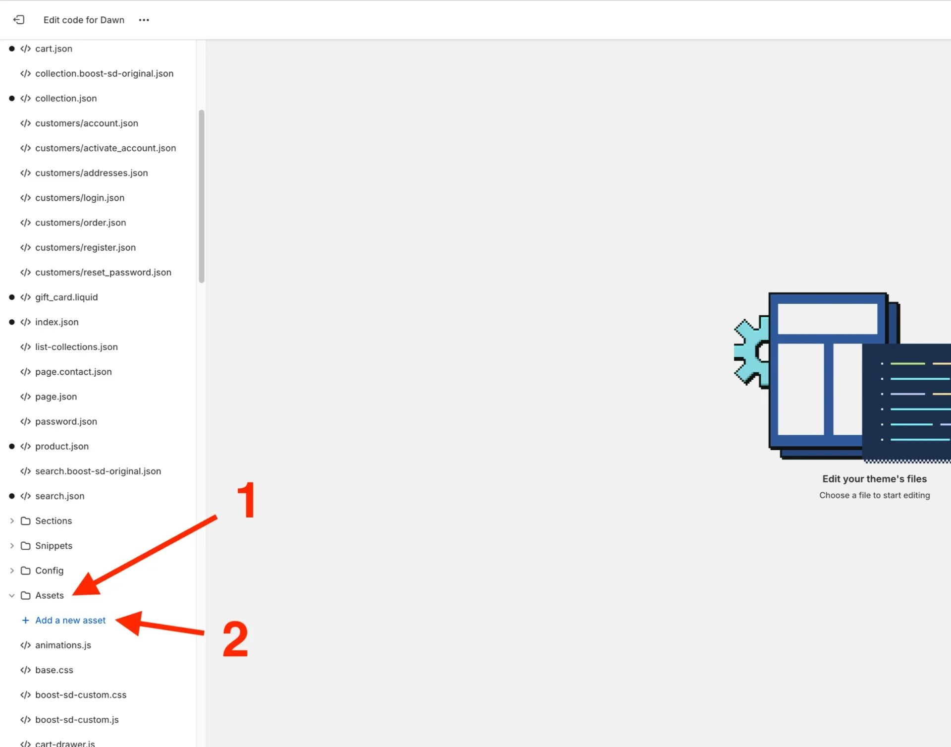
Step 8. Create a blank file and name it “section-imagecarousel” leave it as the default .css extension.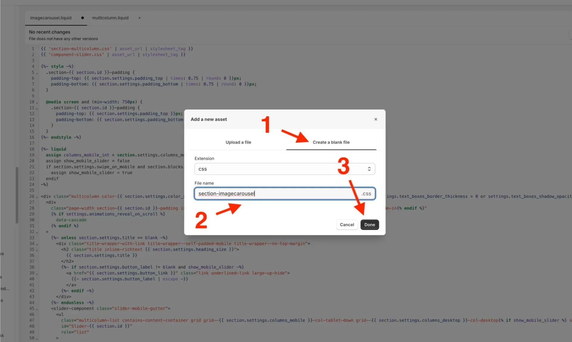
Step 9. Copy the CSS code existing from Assets/section-multicolumn.css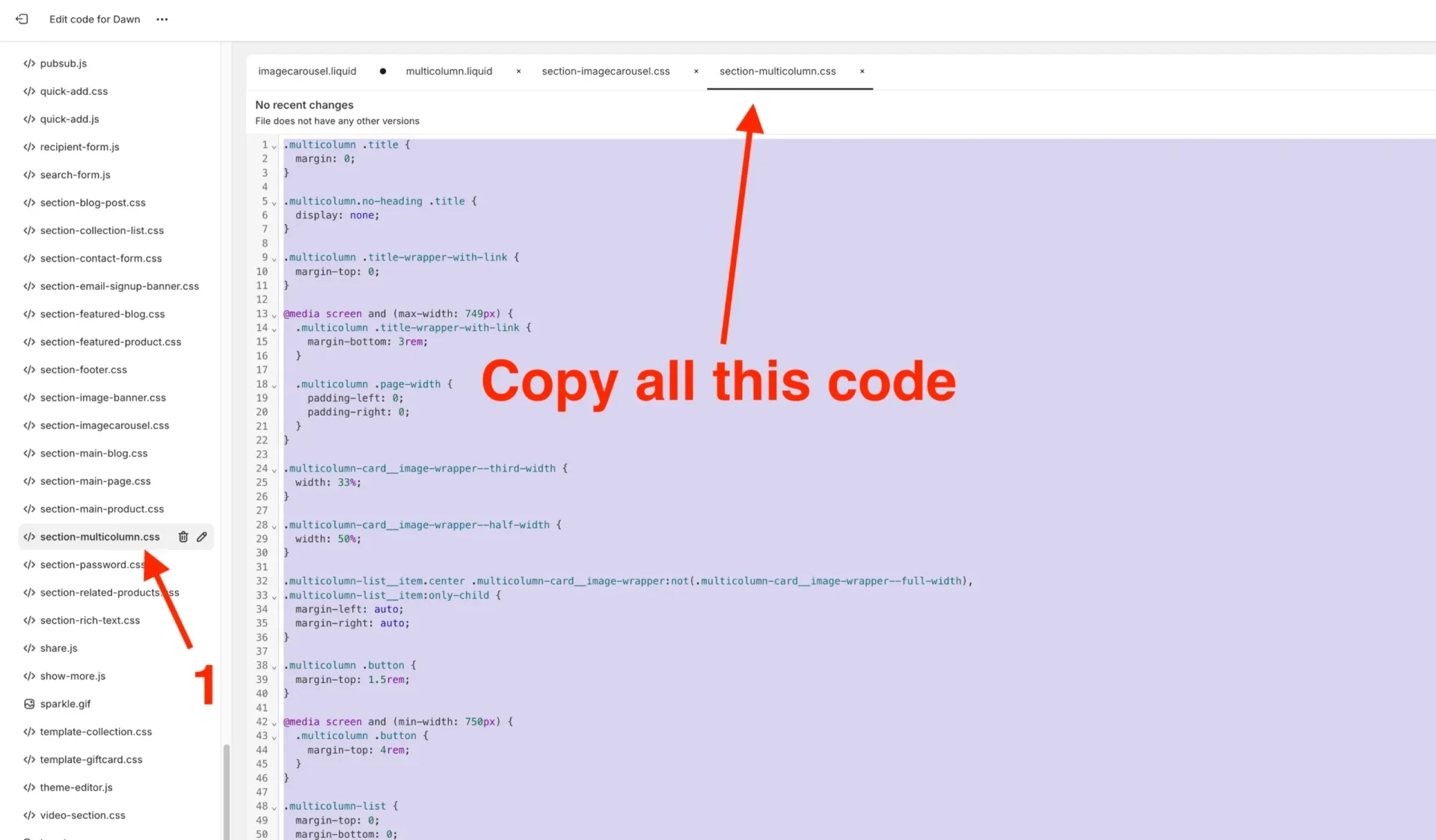
Step 10. Paste the code in the newly created section-imagecarousel.css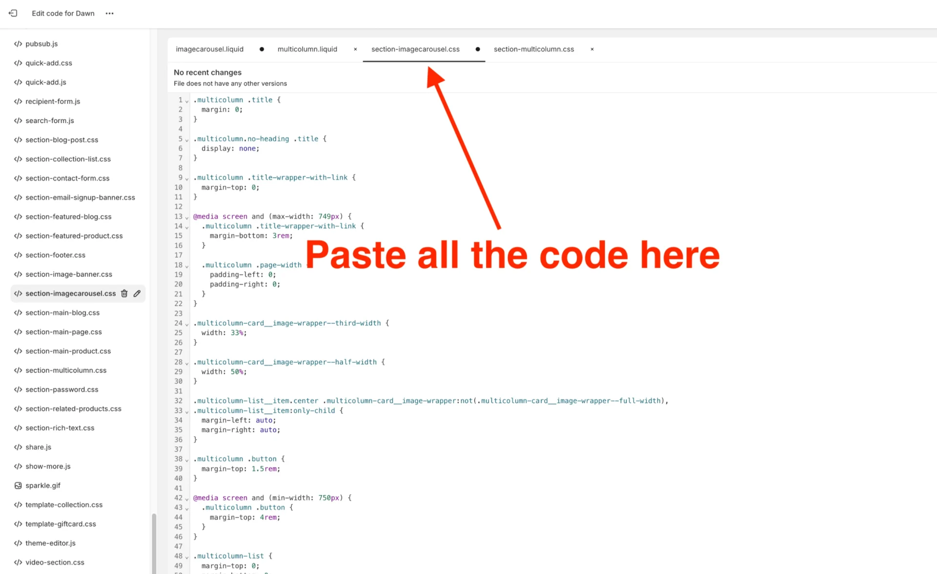
Step 11. Include section-imagecarousel.css into the imagecarousel.liquid.
We can do this by copying the top line of code in the imagecarousel.liquid file, then paste it on the line directly below and change the code to replace the section-multicolumn.css part with section-imagecarousel.css. This will read from our newly created.css file instead of the multicolumn one.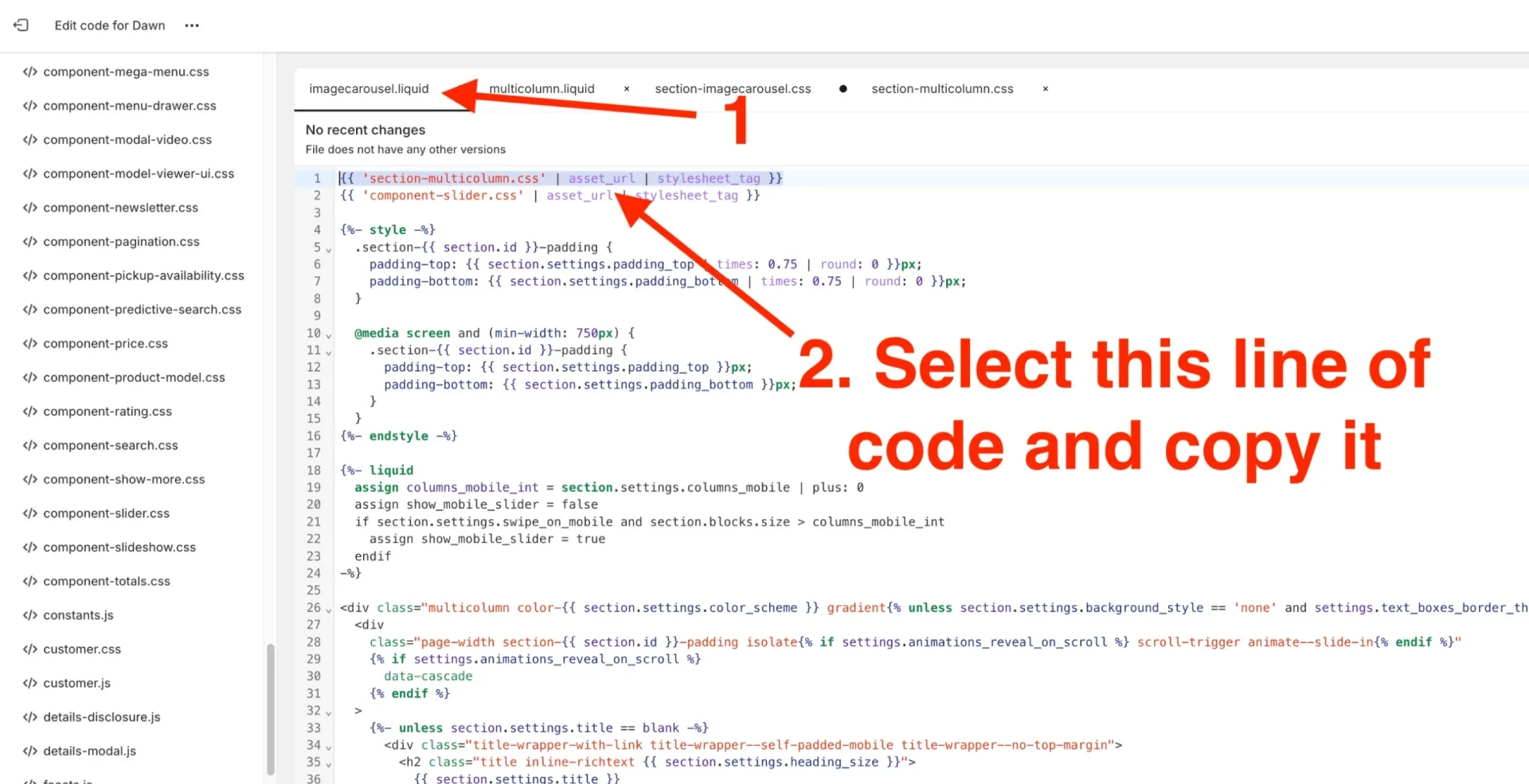
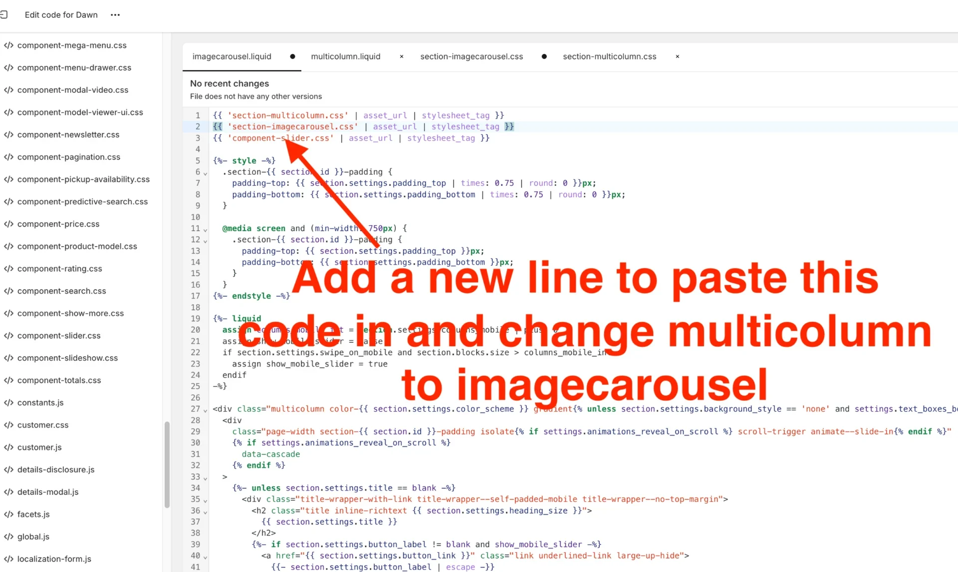
Step 12. – Copy and paste the CSS code below into the imagecarousel.liquid just below the third line: {{ ‘component-slider.css’ | asset_url | stylesheet_tag }} line and above the first {%- style -%} line which appears.
<style>
.custom-imagecarousel-slider.multicolumn .title,
.custom-imagecarousel-slider.multicolumn .subtitle {
color: {{ section.settings.imagecarousel_title_color }}
}
.custom-imagecarousel-slider .multicolumn-card__info h3,
.custom-imagecarousel-slider .multicolumn-card__info p {
color: {{ section.settings.imagecarousel_text_color }};
}
.custom-imagecarousel-slider.multicolumn {
padding: 35px 0px;
background: {{ section.settings.imagecarousel_section_background }};
}
.custom-imagecarousel-slider .multicolumn-list__item {
background: {{ section.settings.imagecarousel_background }};
}
.custom-imagecarousel-slider .slider-buttons .slider-button.slider-button--next,
.custom-imagecarousel-slider .slider-buttons .slider-button.slider-button--prev {
background: {{ section.settings.arrow_bg_color }};
border-radius: 50%;
padding-left: 0;
padding-right: 0;
}
.custom-imagecarousel-slider .slider-buttons .slider-button.slider-button--next svg,
.custom-imagecarousel-slider .slider-buttons .slider-button.slider-button--prev svg {
color: {{ section.settings.arrow_color }};
}
.custom-imagecarousel-slider .slider.slider--mobile {
overflow-y: hidden;
column-gap: unset;
}
.custom-imagecarousel-slider .slider-buttons {
display: flex !important;
}
</style>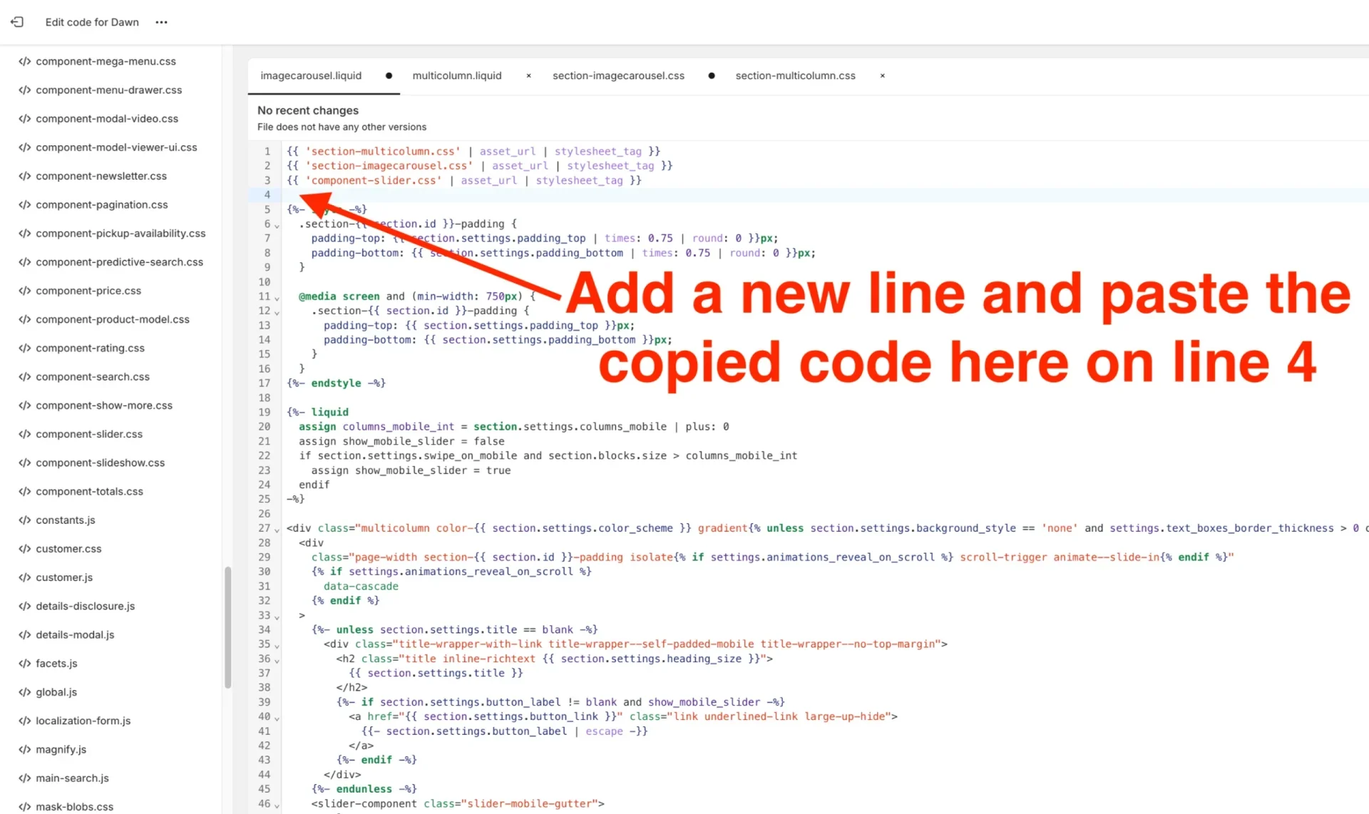
Step 13. Add “custom-imagecarousel-slider” in the div with class “multicolumn color” – the first div appearing in this file. The code should be added before “multicolumn color”, but, don’t replace it.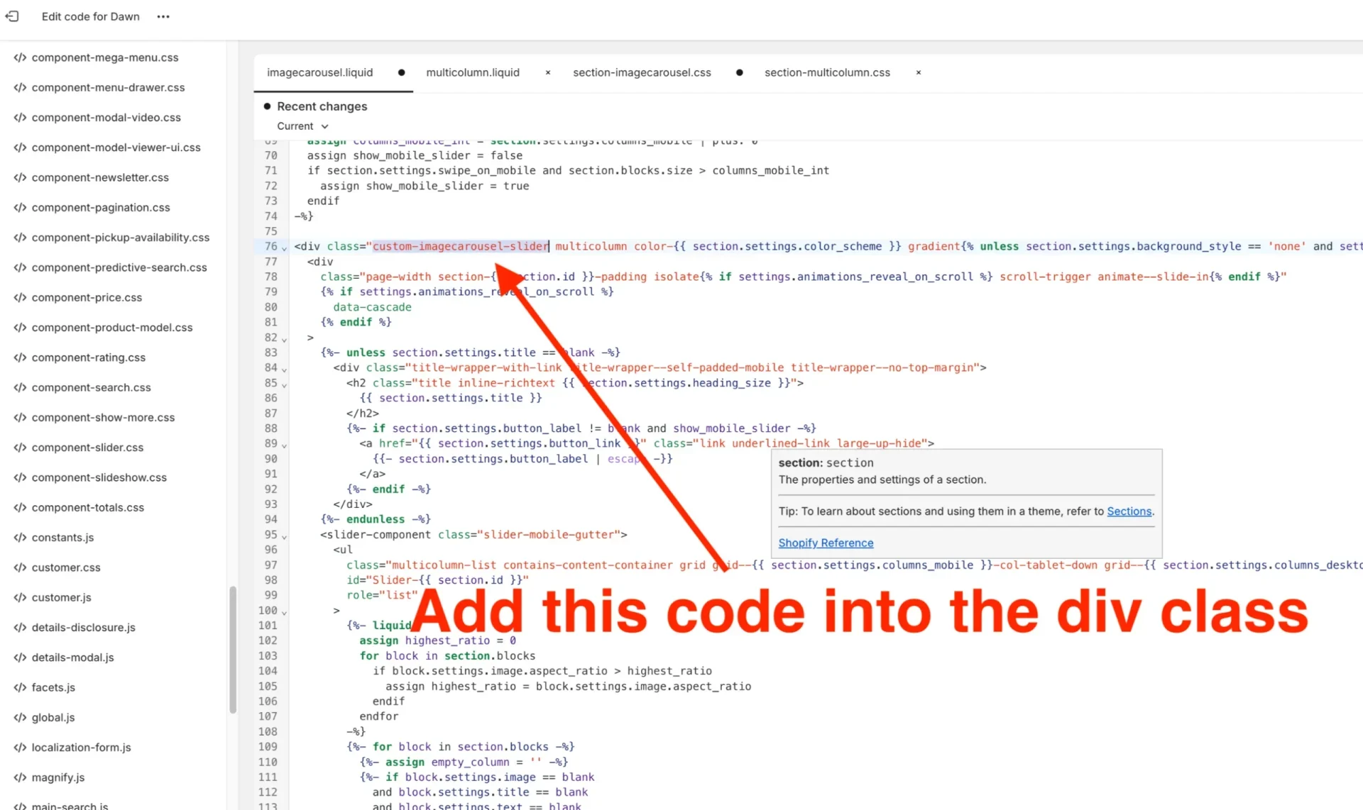
Step 14. Go to the ul tag that first appears (just below the slider-mobile-gutter slider component class) and add “slider–everywhere” into the class name before “multicolumn color”, but, don’t replace it.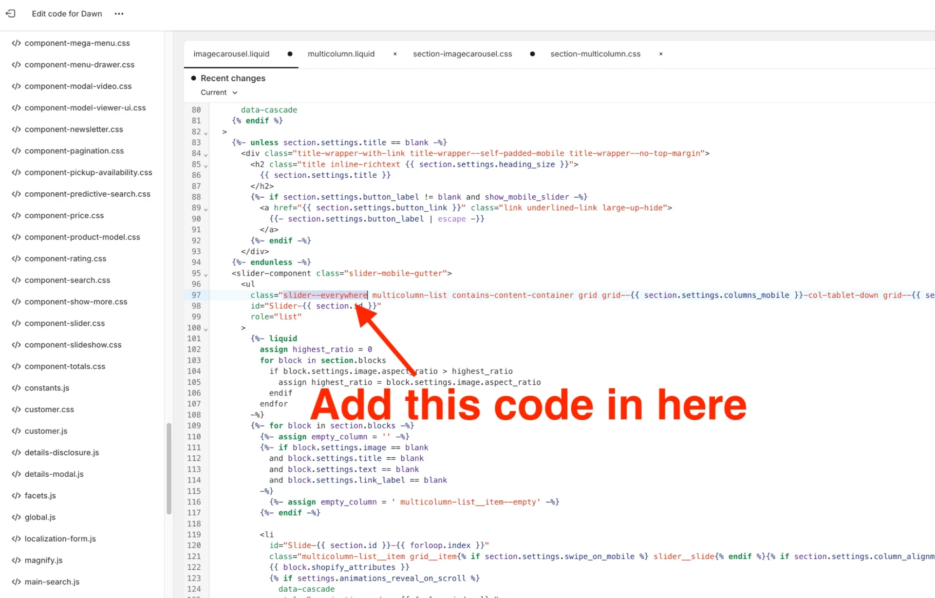
Step 15. Replace code: “t:sections.multicolumn.presets.name” with “Image Carousel” labels in the JSON settings part.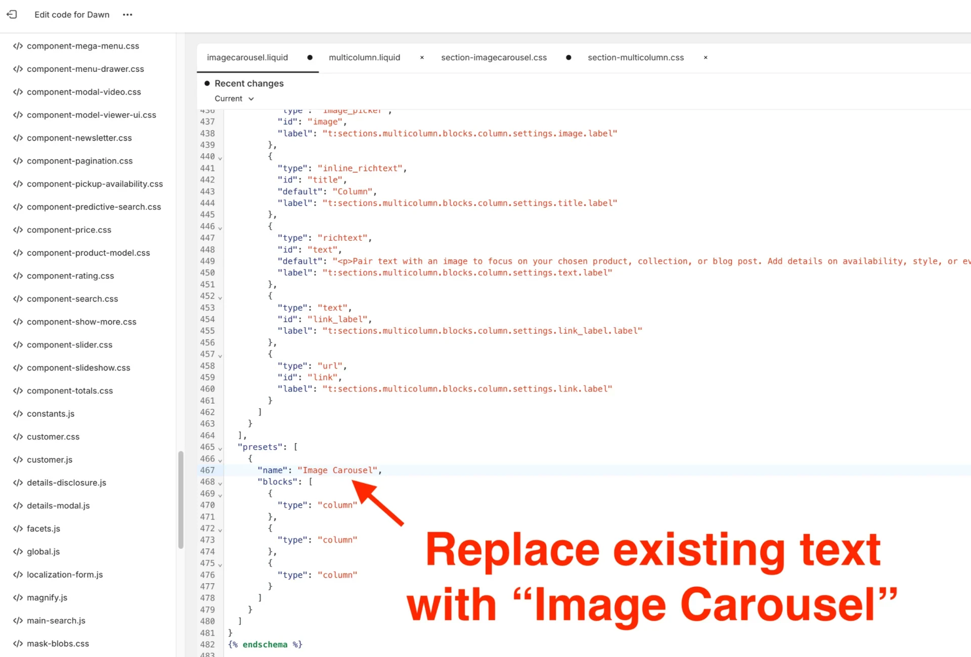
Step 16. Replace code: “t:sections.multicolumn.settings.title.label” with “Image Carousel” under the blocks code settings: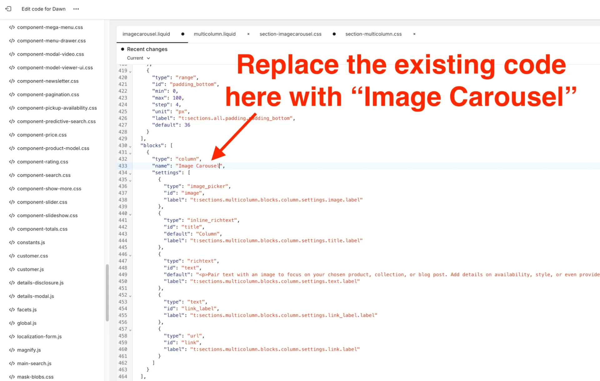
Step 17. Replace code: t:sections.multicolumn.blocks.column.name” with “Image Carousel”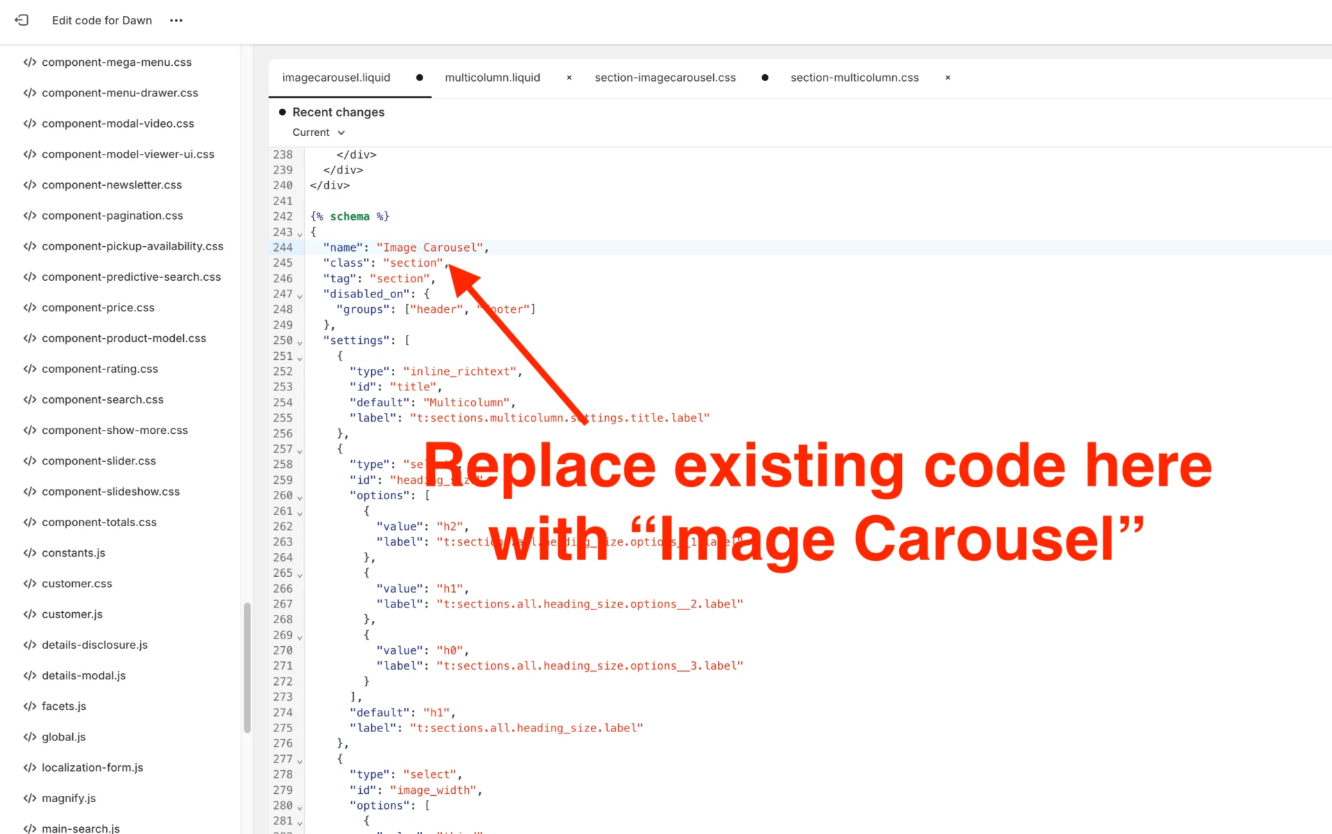
Step 19. Replace code which is further down: “t:sections.multicolumn.blocks.column.name” with “Image Carousel”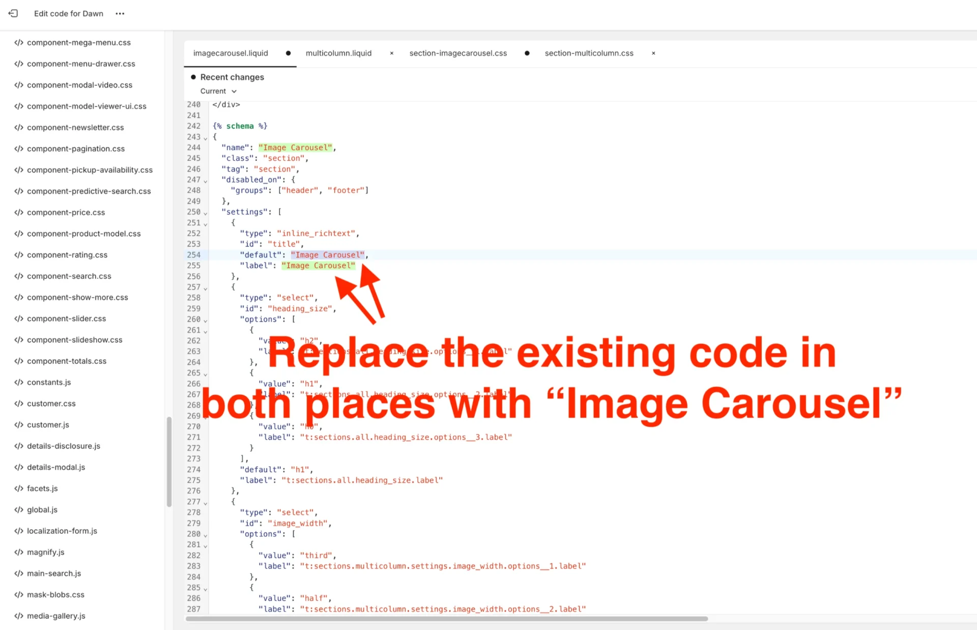
Step 20. Remove this “view more” button code, which we no longer needed. It appears just after closing tag “</slider-component>”:
<div class="center{% if show_mobile_slider %} small-hide medium-hide{% endif %}">
{%- if section.settings.button_label != blank -%}
<a
class="button button--primary"
{% if section.settings.button_link == blank %}
role="link" aria-disabled="true"
{% else %}
href="{{ section.settings.button_link }}"
{% endif %}
>
{{ section.settings.button_label | escape }}
</a>
{%- endif -%}
</div>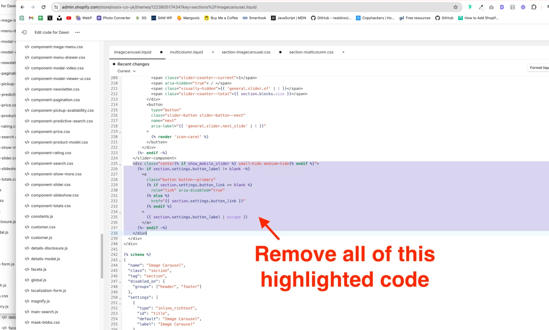
Step 21. Look for <div class=”multicolumn-card__info”> then three if.block.settings rows down, you’ll see this code to remove:
{%- if block.settings.link_label != blank -%}
<a
class="link animate-arrow"
{% if block.settings.link == blank %}
role="link" aria-disabled="true"
{% else %}
href="{{ block.settings.link }}"
{% endif %}
>
{{- block.settings.link_label | escape -}}
<span class="icon-wrap"> {% render 'icon-arrow' %}</span></a
>
{%- endif -%}
Step 22. Now paste this new code in the empty space:
{%- if block.settings.link_label != blank -%}
<div>
<a
class="button button--primary"
{% if block.settings.link == blank %}
role="link" aria-disabled="true"
{% else %}
href="{{ block.settings.link }}"
{% endif %}
>
{{ block.settings.link_label | escape }}
</a>
</div>
{%- endif -%}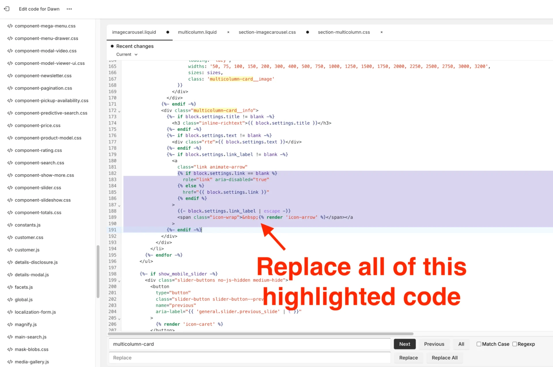
Step 23. Go to div class “slider-buttons” and replace code “medium-hide” with:
{% if section.blocks.size < 5%} large-up-hide{% endif %}{% if section.blocks.size <= 3%} medium-hide{% endif %}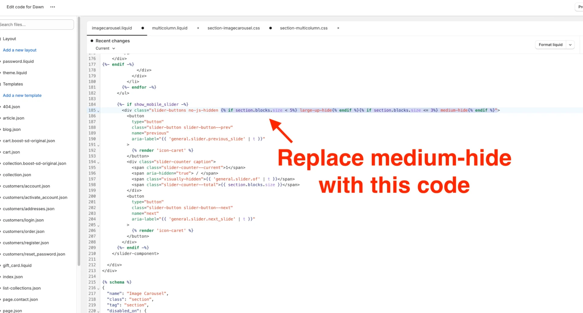
Step 24. Press Save and go back to the section-imagecarousel.css file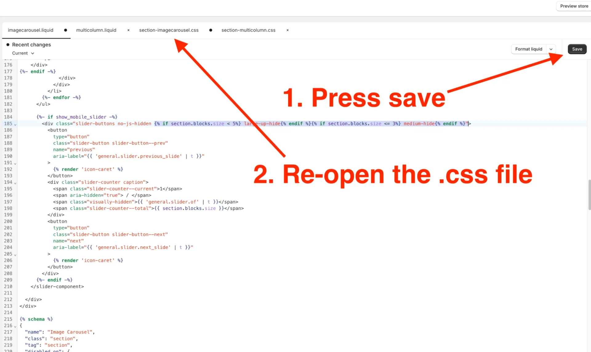
Scroll to the bottom of the file and paste the following code:
/* latest CSS :: starts */
.grid--2-col-tablet.slider--everywhere .multicolumn-list__item {
margin-top: 0;
}
.multicolumn .slider--everywhere+.slider-buttons {
display: flex;
}
.slider.slider--mobile {
padding: 0;
position: relative;
flex-wrap: inherit;
overflow-x: auto;
scroll-snap-type: x mandatory;
scroll-behavior: smooth;
scroll-padding-left: 1rem;
-webkit-overflow-scrolling: touch;
margin-bottom: 1rem;
}
.custom-imagecarousel-slider .slider-buttons {
position: absolute;
top: 50%;
justify-content: space-between;
width: 100%;
}
.custom-imagecarousel-slider .slider-buttons .slider-button.slider-button--next {
padding-left: 18px;
}
.custom-imagecarousel-slider .slider-buttons .slider-button.slider-button--prev {
padding-right: 18px;
}
.custom-imagecarousel-slider .slider-counter {
display: none;
}
.custom-imagecarousel-slider .slider-button .icon {
height: 1.6rem;
vertical-align: middle;
}
.custom-imagecarousel-slider .title-wrapper-with-link.center {
justify-content: center;
}
.custom-imagecarousel-slider .multicolumn-list__item {
box-shadow: 0 1px 6px 0 rgb(32 33 36 / 28%);
margin: 2px;
padding: 0 0 0px 0px;
}
@media only screen and (max-width: 800px) {
.custom-imagecarousel-slider .multicolumn-list__item {
margin: 10px !important;
padding-bottom: 10px !important;
width: calc(100% - 2rem);
}
.custom-imagecarousel-slider .grid__item:first-of-type {
padding-left: 5px;
}
.custom-imagecarousel-slider .grid__item:last-of-type {
padding-right: 5px;
}
}
/* latest CSS :: ends */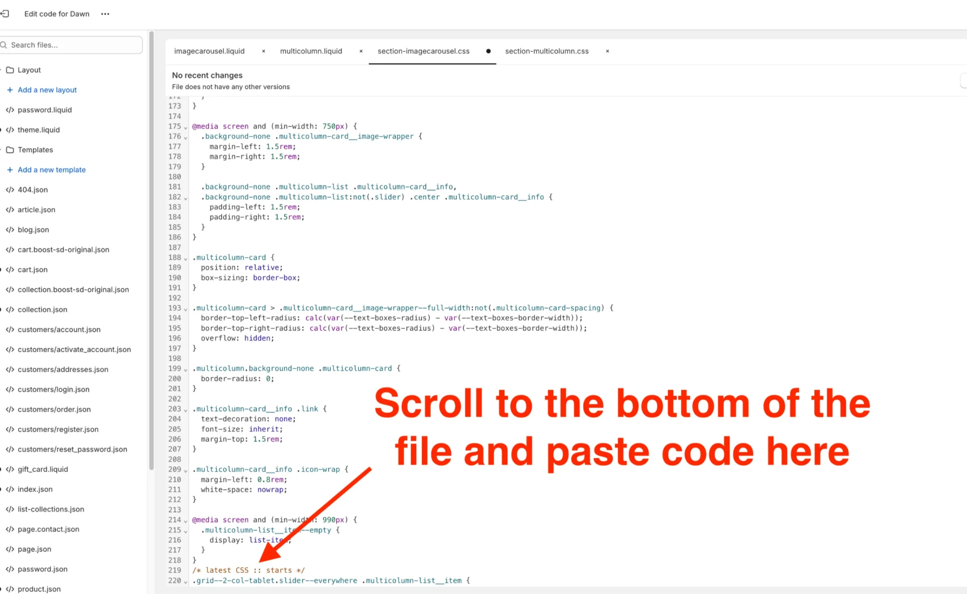
Step 25. Go back to the imagecarousel.liquid file and find “blocks:”, two lines above that will be a curly closing brace”}” add a comma after this hit enter to add a new empty line.
Add the following code on that newly created line:
{
"type": "color",
"id": "imagecarousel_section_background",
"label": "Section background",
"default": "#eaeaea"
},
{
"type": "color",
"id": "imagecarousel_background",
"label": "imagecarousel background",
"default": "#fff"
},
{
"type": "color",
"id": "imagecarousel_title_color",
"label": "Title text color",
"default": "#000"
},
{
"type": "color",
"id": "imagecarousel_text_color",
"label": "imagecarousel text color",
"default": "#000"
},
{
"type": "color",
"id": "arrow_color",
"label": "Arrow color",
"default": "#fff"
},
{
"type": "color",
"id": "arrow_bg_color",
"label": "Arrow background",
"default": "#000"
}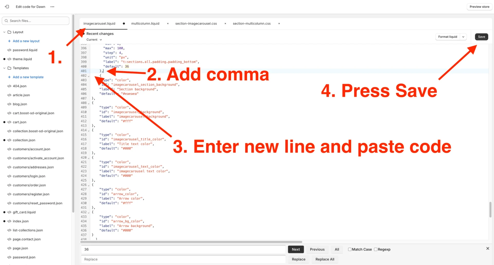
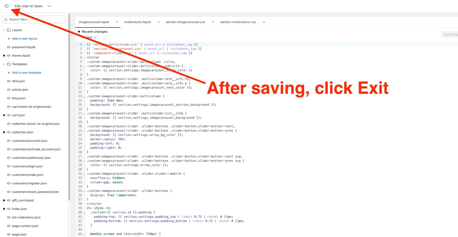
Step 26. Click Exit at the top left of the screen
Adding our newly created Image Carousel section to the Product Page
Step 27. Click “Customize” Select products from the dropdown list menu at the top of the screen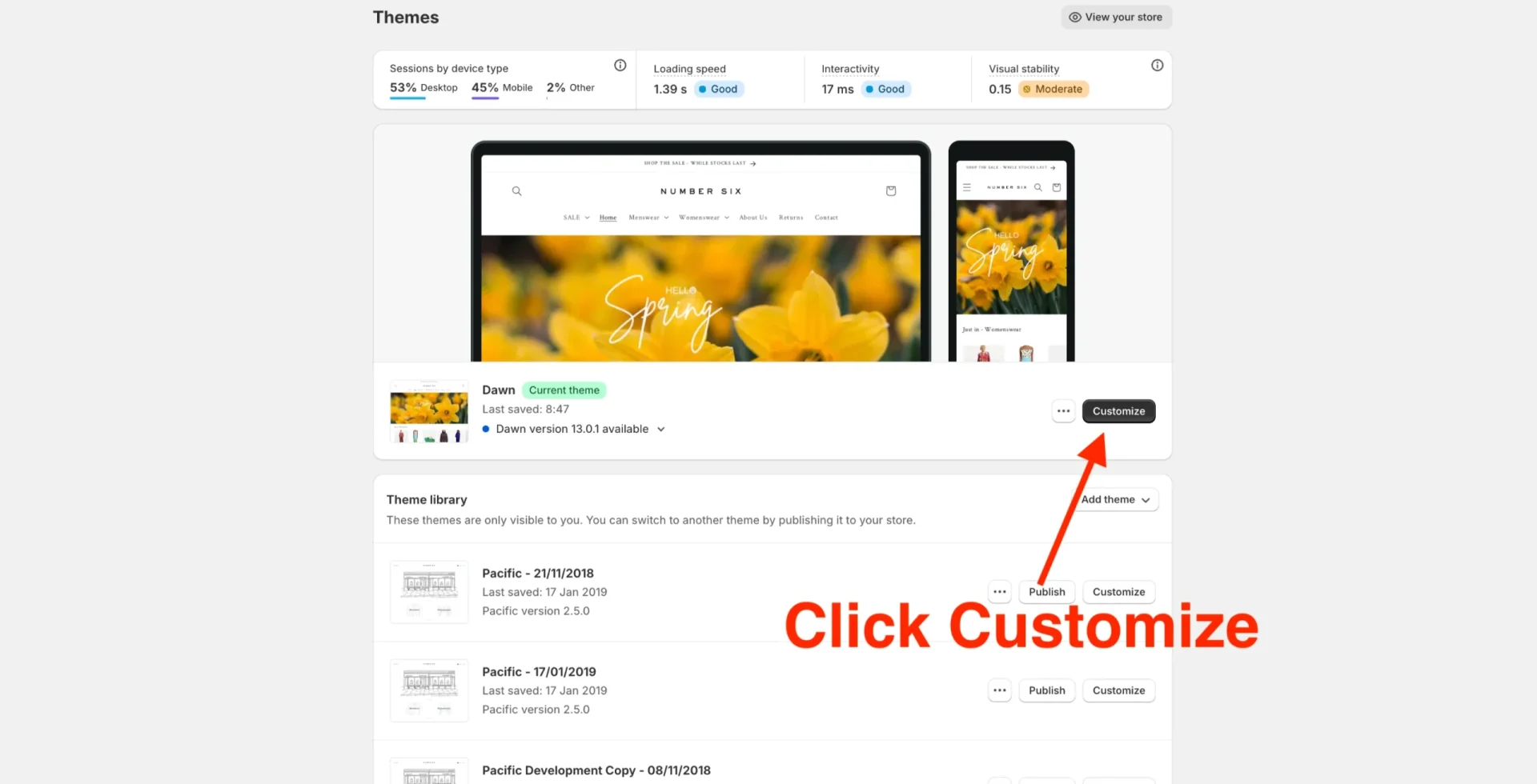
Step 28. Scroll down to where you’d like the Image Carousel to appear
Step 29. Hover the cursor over and click Add a new section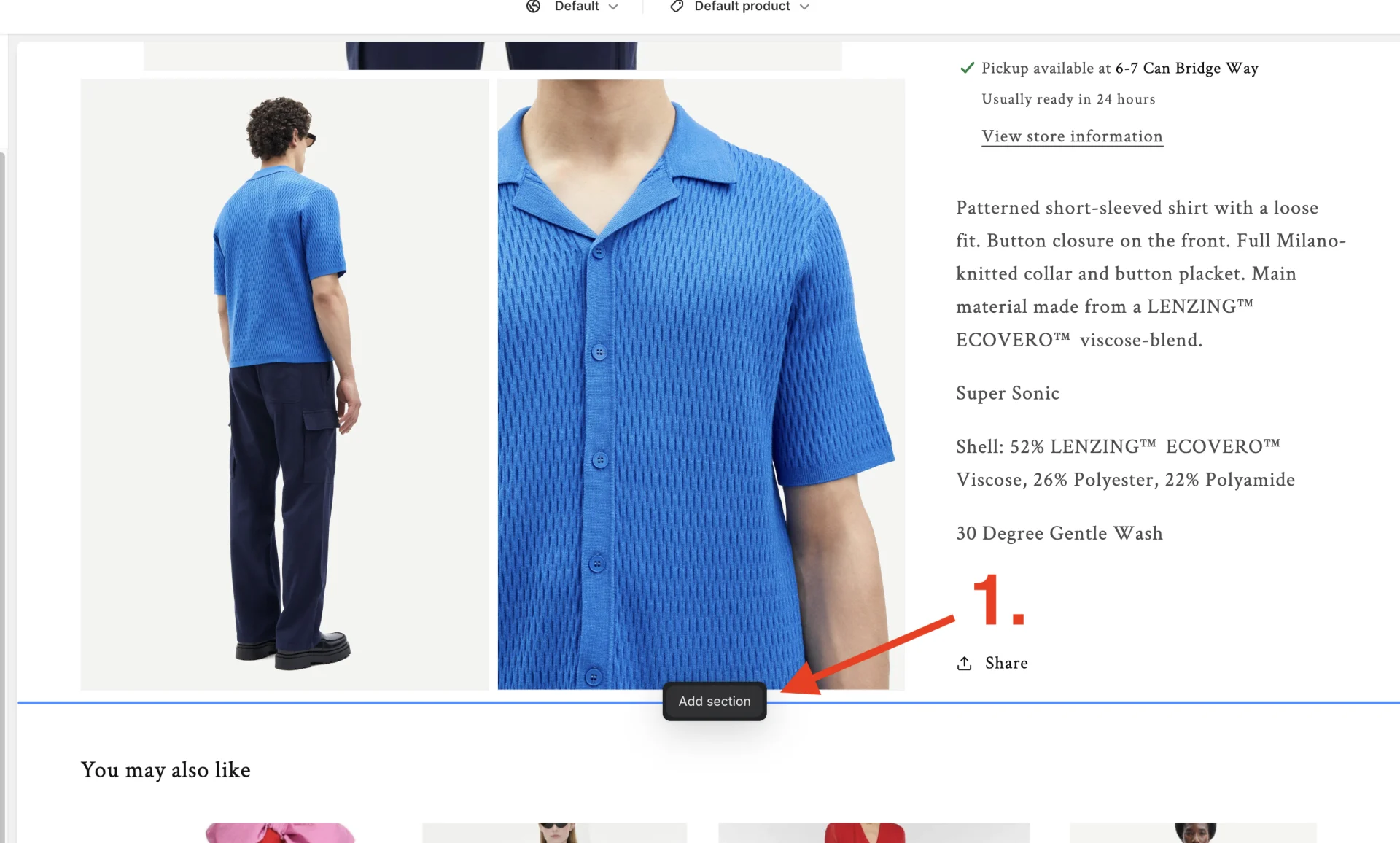
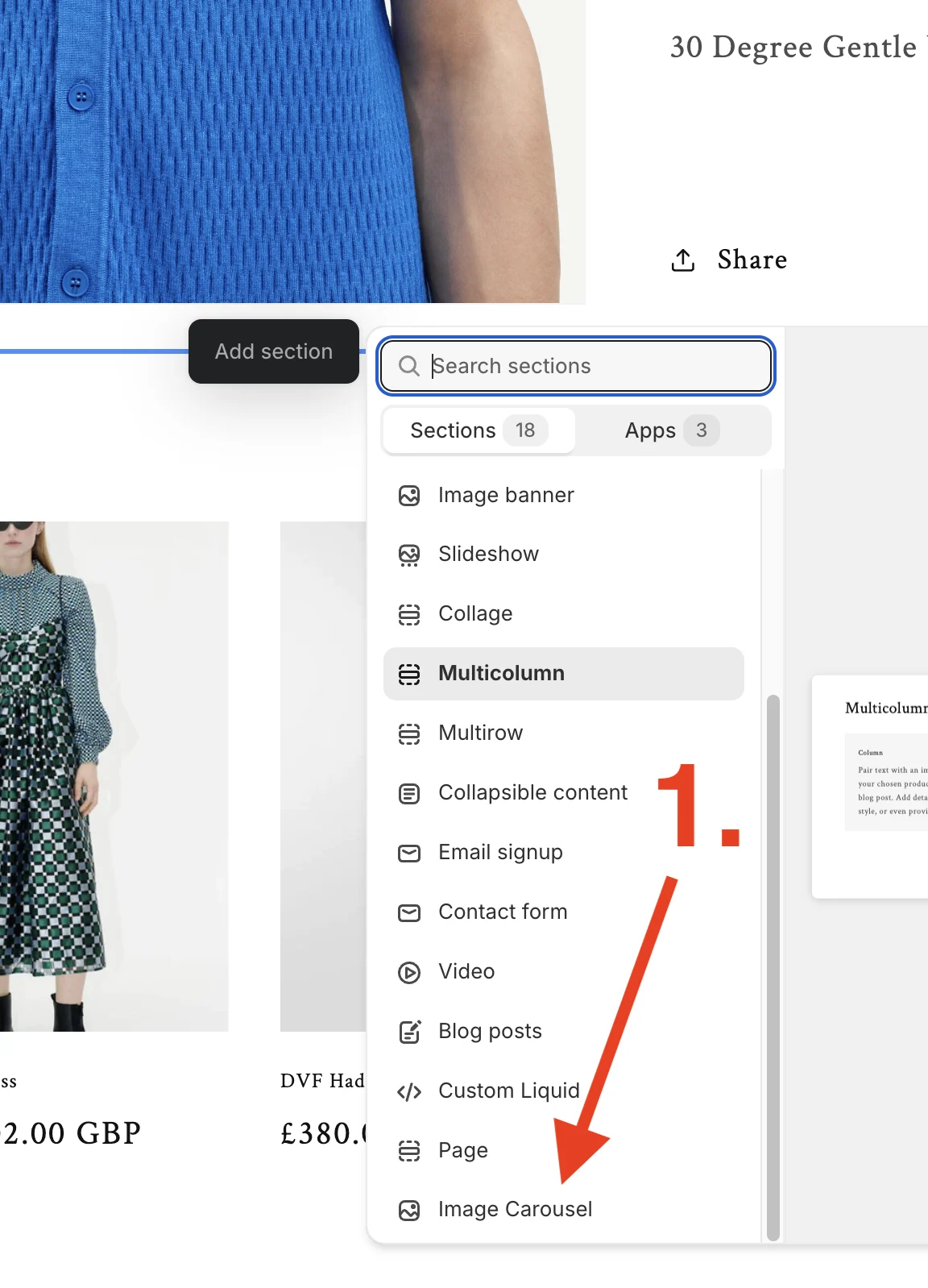
Step 30. Scroll to the bottom of the list, where you’ll find our newly created Image Carousel block
Step 30. Now, on the left side of the screen, you can add as many image carousels as you require.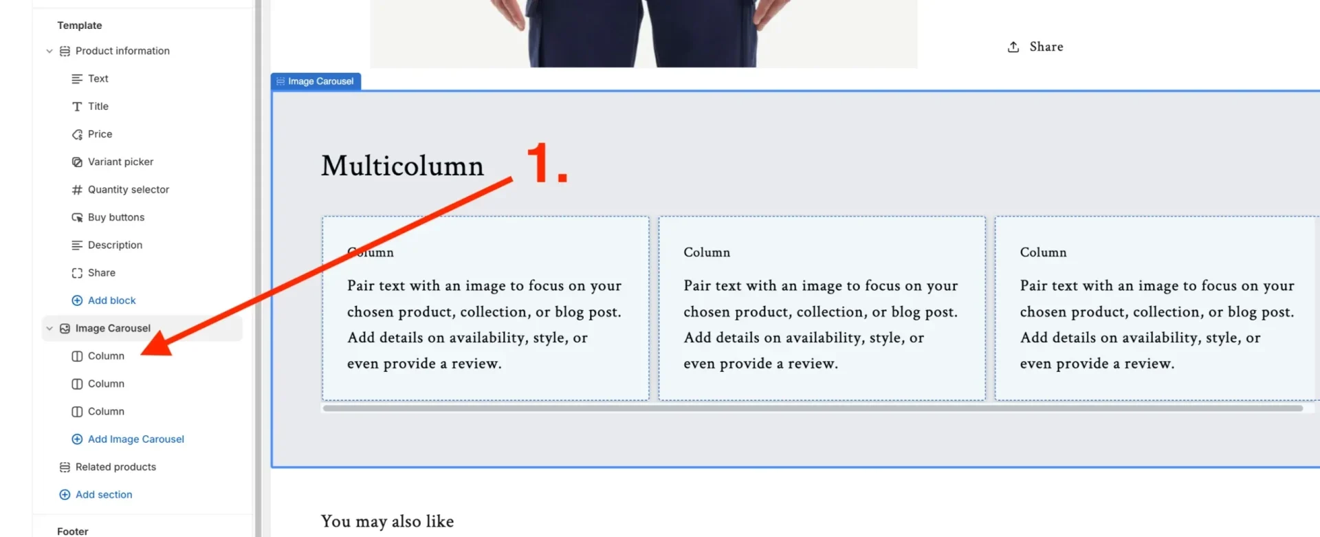
Step 31. Select a column to edit it, and on the right of the screen, you’ll see the option to add an image.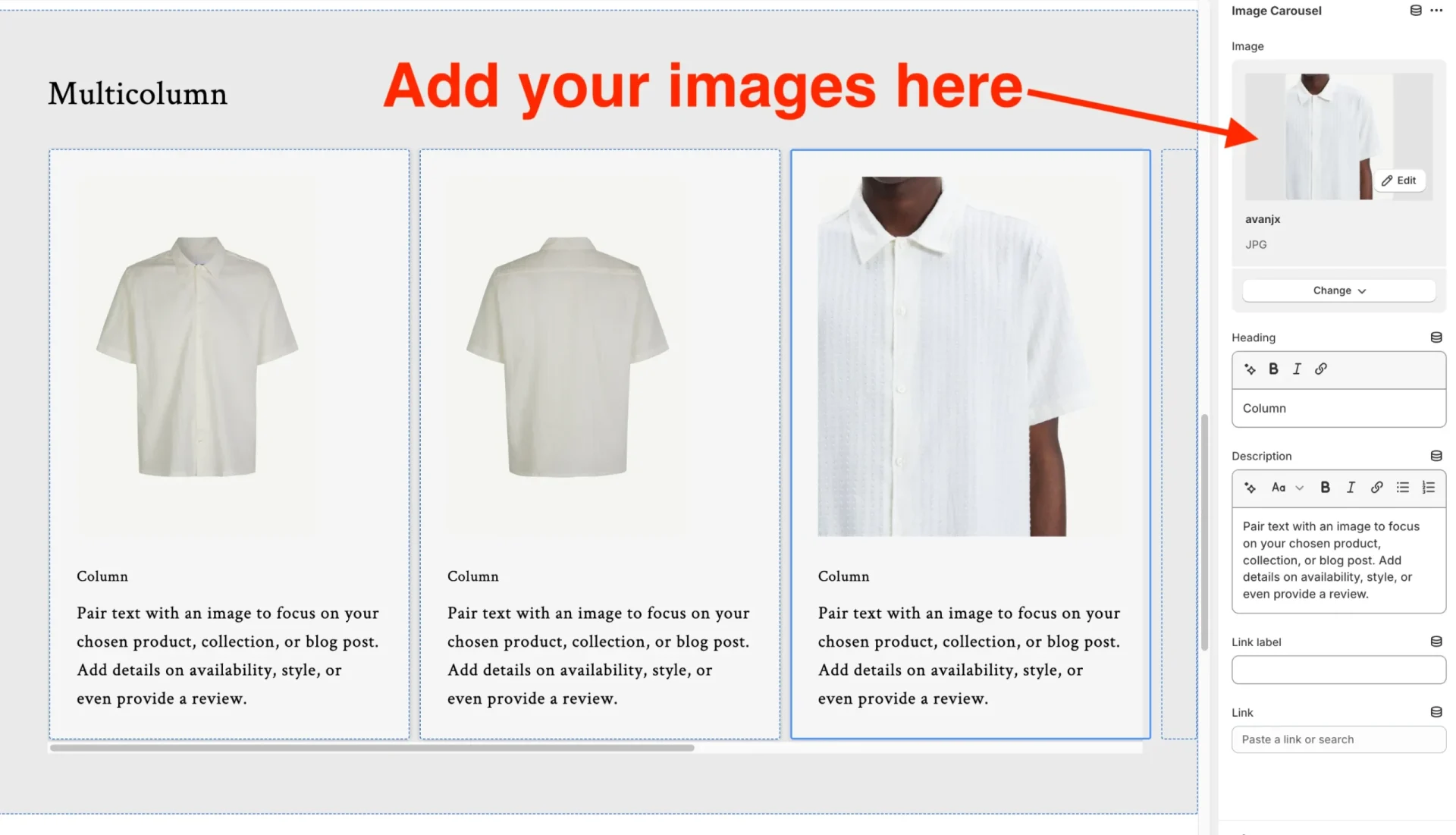
Final step (32). Adjust the settings to your liking; if you’d like just images and no text, delete the text from the current fields.
Now, we have added the carousel. It’s worth mentioning that the exact images you choose here will appear on all of your product pages. If you’d like to choose unique and specific images in the carousel to feature on every product page. Please read our step-by-step guide here (add link).
Conclusion
This step-by-step guide allows you to save on using paid plug-ins whilst giving you all the functionality necessary for a great-looking, customisable image carousel that works on all breakpoints (desktop, tablet, and mobile). If you’re cautious about editing your store’s code and liquid files, don’t hesitate to contact us for help. Ask for help If you’re looking for other ways to increase your website’s E-commerce revenue, check out our SEO services to get on page 1 of Google for your target keywords.
If you’re new to Shopify, check out our Shopify Guides.